When I purchased the case from Physh, he was able to print out 3 pieces of art for me to use on the control panel. The catch is, I’d have to figure out how to label the buttons myself. The first piece of art was created by Joe Vriens from Udon for the official release of MvC2 on XBLA and PSN:
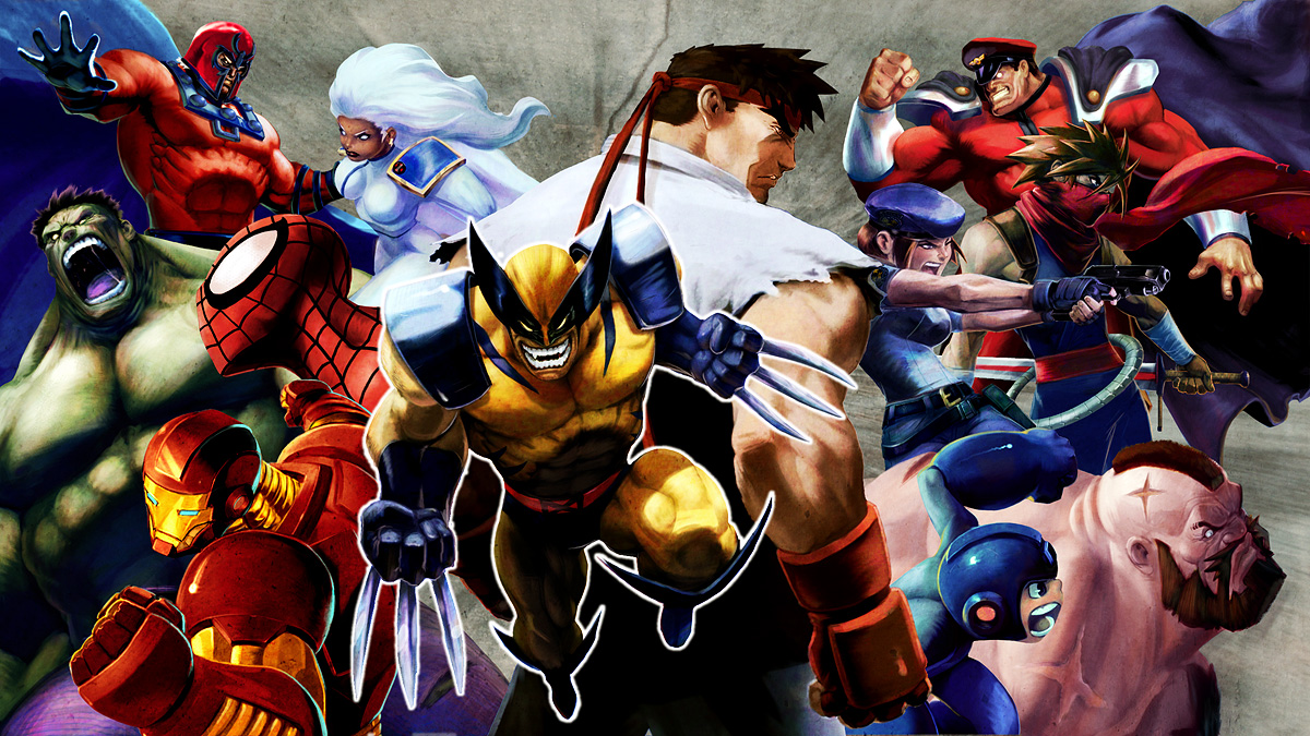
Logan is gonna cut somebody...
Looks good for a bottom picture, but not for the control panel on this one
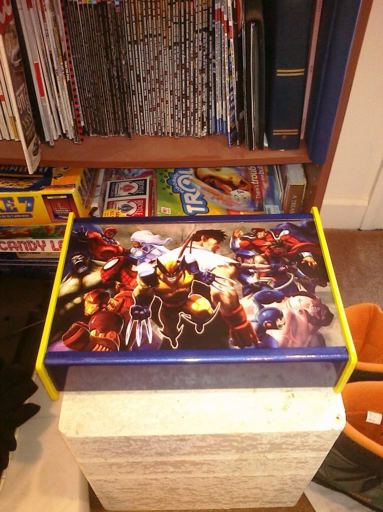
The second piece I had printed was a little more interesting. It was another work by Joe Vriens used as a promotional poster for MvC2. Someone had taken 2 copies of the same image and combined them, giving it an interesting mirror wall effect:

From this...

To this. Cool, huh?
This one worked a little better with the case, given that the artwork is quite dark. While a lot of the characters are still covered by the buttons, since the artwork is mirrored on the left, you still get to see a good bit of them. Wolverine wasn’t as covered, but Ryu got the short end of the stick on either the left or the right, where he was either totally obscured by the buttons or beheaded by the joystick and its dust cover. If I could figure out how to label the buttons, this one could work. But it would be settling for something instead of being what I truly wanted.
The third piece I knew I wasn’t going to use, but I liked the wallpaper so much I decided to have it printed just for kicks:

Didn't have a chance, but it's a great wallpaper
This one took me back to the arcade for a minute, as I can still hear Spidey’s ‘Web Swing!’ and Strider’s swords slicing and ‘schwing!’ing away while waiting in line for my crack at Street Fighter Alpha 3 (or whatever SFII variant was available). While I really loved the clean look of the art, this one was never seriously in contention. Nick doesn’t use Spiderman or Strider, and the buttons cover up Strider’s entire top half of his body. Still, the picture was cool enough that I sent it to his Xbox and made it his wallpaper, just because…
I decided to give the mirror image art a shot. Placing the art on the case and cutting the holes for the buttons and joystick was pretty easy, and besides a number of characters being hidden, it didn’t look too bad. The main issue was figuring out the button labels. The ideal thing to do would be to make a template in Photoshop showing where the buttons and joystick were, positioning the button labels on the template, and printing them on a transparent sheet. The sheet would lay on top of whatever artwork I ended up using, and could be reused if I chose to swap the art at some point. The only problem with that was there wasn’t any legal size transparent paper readily available at any stores in my area. I then considered making the Photoshop template, importing the artwork, making the labels and printing it myself. The problem with that was the case was a non-standard size. The artwork needed to be a little less than 13 7/8” (not a problem) and slightly bigger than 8 ½” (a much bigger problem). I could have gone to Kinko’s and had it printed, but that would be a lot of time and money for some trial and error printing. I thought about simply printing the button labels in reverse on regular clear labels, cutting them out by hand, and sticking them on the inside of the plexiglass so they wouldn’t peel off, but making the cuts perfectly even and lining the labels up evenly didn’t work very well. It was becoming apparent I’d have to outsource the art. The big question was who I could get to do it. My buddy Laz had helped out with El Kabong2, but our schedules were conflicting and I wanted to come up with something better than our first attempt (although I would miss out on the gin and tonics).
So, back to the SRK forums I went. Finding someone good at making control panel art wouldn’t be too hard.. The forums have threads dedicated to the Madcatz TE and SE sticks and to Hori’s HRAP line of sticks that have more art than you can shake a stick at. At the time of this writing, the Madcatz template thread is over 561 pages long! However, while template and assistance are readily available for those mass produced sticks, finding someone to do a custom template would be a bit trickier. Often, those requests are directed to the ‘Image Mishmash’ thread. However, as with any online forum, some threads are more receptive than others. After about a week with no response, I decided to take a chance and go the direct route.
D3v4st4t0r, or d3v for short, is known on a few boards such as SRK and Capcom-Unity as one of the most prolific designers of TE templates around. He has done numerous character specific art for almost every SFIV character in the roster. One of the things I admired about his work was that it was more than just resizing some wallpaper and adding some lens flare. The templates had a fine balance of size, color and weight. All of the elements fit together, and obstruction by the buttons and stick were minimized. He’s even gone thru the process of recreating a number of old school and new school Sega arcade control panels, customizing them to fit the character and button color combination at hand.

On the scene!

Cammy's nice...assets....

One of the funnier pictures I'd seen
The thing was, most of the templates I saw him work on were for either the TE, SE or a Hori stick. I hadn’t seen any ‘custom’ work. Well, the only thing I could do was ask. So, I sent him a PM on the SRK site, explaining my situation, asking for his assistance and offering to compensate him for his work. If he told me to piss off, so be it. A day later, I got his reply - ‘Let me see what I can do’. We sent a few more messages back and forth to square up a few things. He wanted to make sure the colors matched, so I sent his some pics of the case and the Duplicolor and Rustoleum websites with the links to the paint I used in case the pictures didn’t come out very well. After a few more days, d3v sent me a test picture. I was a bit nervous before i opened the link. I pretty much gave him carte blanche on creating the template, only giving him the colors and Wolverine to work with. Would it look generic? Overwrought? Totally off base for what I was looking for (even though I didn’t know what I was specifically looking for)? Well, that worry was unfounded...

Yeah, a masterpiece...
I was literally blown away by the art, which was much better than anything I had seen so far and that I could have created. Wolverine was front and center with the yellow and blue outfit, without any of the buttons cutting him off. The yellow background used the same MvC2 poster I toyed around with, but with a much better effect. Ryu and Wolverine could still be made out even with the buttons and joystick in the way. I couldn’t have asked for more. Before going to print, we made a few tweaks. I asked d3v to change the color on the MvC2 logo from yellow to white, as it felt like there would be a bit too much yellow once the buttons were added. He changed the yellow tint on the background ever so slightly as well. I added button labels pulling some of the colors that were on the template and added one of Nick’s sayings to the template. d3v also incorporated his logo as an added touch :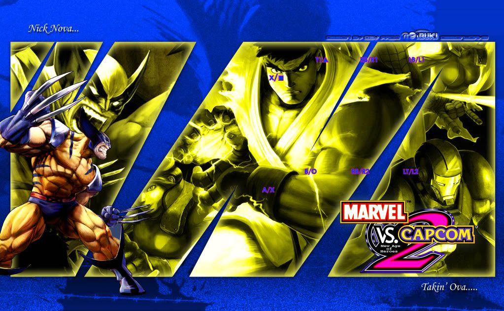
THIS is how to personalize a MvC stick...
With the art finalized I had to get it printed. This turned out to be a little more challenging than I thought. I went to Kinko’s, since I knew I would have to print the art on 11”x17” paper. Since the art was close to 9” wide, I wouldn’t have to worry about anything getting cutoff. The problem is, Kinko’s policy does not allow them to print any copywrited images. With a big picture of Wolverine and the MvC logo, I couldn’t even fight that. Fortunately, it was 2 young guys that were manning the shop that day. I explained what I was doing, showed some of the pictures of the build I had in the phone, and assured him this was for personal use and not for sale (I’m actually losing money on this…). The clerk said they still couldn’t do it… but if I were to use one of the self service computer terminals and printed it out they couldn’t really say anything. So I asked him to put some cardstock in the printer and help someone else while I did my thing. A few minutes and few dollars later I had the print done. I used their trimmer, cut the art down to size, thanked the clerks and drove home for final assembly.I found out later that while d3v had done a number of templates for people, I was the first custom project he took on. I’m honored. Really, I can’t thank him enough, as his artwork would really take the project over the top. He’s since started his own blog where he has posted some of his work and details how it was done. If you want to know what he did to put the art together, look here. If you want to see some amazing templates or commission a template for him, visit his site: http://www.d3vlicious.com/. Tell him I sent you…
Personally, I should thank you for giving me the chance to work on something other than a TE/HRAP and get a shot at a custom.
ReplyDelete